Conducting Heuristic Analysis for an Optimized User Experience in a 3D Modeling SaaS Product
Conducting Heuristic Analysis for an Optimized User Experience in a 3D Modeling SaaS Product
Snaptrude 3D
6 min read
6 min read
Role:
Role:
UX Researcher
UX Researcher
Heuristic Analyst
Heuristic Analyst
Timeline:
Timeline:
1 Week
1 Week
Industry:
Industry:
SaaS Platform
SaaS Platform
3D Design
3D Design
"Snaptrude is a 3D building design and analysis software that uses advanced algorithms, and automation to streamline the design process for architects, engineers, and construction professionals."
While trying out Snaptrude I discovered that the software had some usability issues which began to turn working in it difficult.
As an architect, I was accustomed to using popular tools like SketchUp, Revit, and ArchiCAD for 3D modeling along with BIM solutions. I found that Snaptrude, with its clean interface, has potential, although it needs to revamp itself to align with the existing tools to ensure effective user migration and retention.
Determined to unlock the full potential of Snaptrude, I thought to fix it up at my own hands following which a thorough evaluation began. Evalutation intent was to identify the areas of the software that need improvement. Guided by the wisdom of Jakob Nielsen's 10 usability heuristics, I delved deep into Snaptrude's interface.
"Snaptrude is a 3D building design and analysis software that uses advanced algorithms, and automation to streamline the design process forarchitects, engineers, and construction professionals."
While trying out Snaptrude I discovered that the software had some usability issues which began to turn working in it difficult.
As an architect, I was accustomed to using popular tools like SketchUp, Revit, and ArchiCAD for 3D modeling along with BIM solutions. I found that Snaptrude, with its clean interface, has potential, although it needs to revamp itself to align with the existing tools to ensure effective user migration and retention.
Determined to unlock the full potential of Snaptrude, I thought to fix it up at my own hands following which a thorough evaluation began. Evalutation intent was to identify the areas of the software that need improvement. Guided by the wisdom of Jakob Nielsen's 10 usability heuristics, I delved deep into Snaptrude's interface.
"Snaptrude is a 3D building design and analysis software that uses advanced algorithms, and automation to streamline the design process for architects, engineers, and construction professionals."
While trying out Snaptrude I discovered that the software had some usability issues which began to turn working in it difficult.
As an architect, I was accustomed to using popular tools like SketchUp, Revit, and ArchiCAD for 3D modeling along with BIM solutions. I found that Snaptrude, with its clean interface, has potential, although it needs to revamp itself to align with the existing tools to ensure effective user migration and retention.
Determined to unlock the full potential of Snaptrude, I thought to fix it up at my own hands following which a thorough evaluation began. Evalutation intent was to identify the areas of the software that need improvement. Guided by the wisdom of Jakob Nielsen's 10 usability heuristics, I delved deep into Snaptrude's interface.
0
0
0
1
1
1
2
2
2
3
3
3
4
4
4
I have used the below Severity Rating for my analysis :
I don't agree that this is a usability problem at all
Cosmetic problem only: fix if time is available
Minor usability problem: fixing this should be given low priority
Major usability problem: important to fix, given high priority
Usability catastrophe: fix this before update can be released
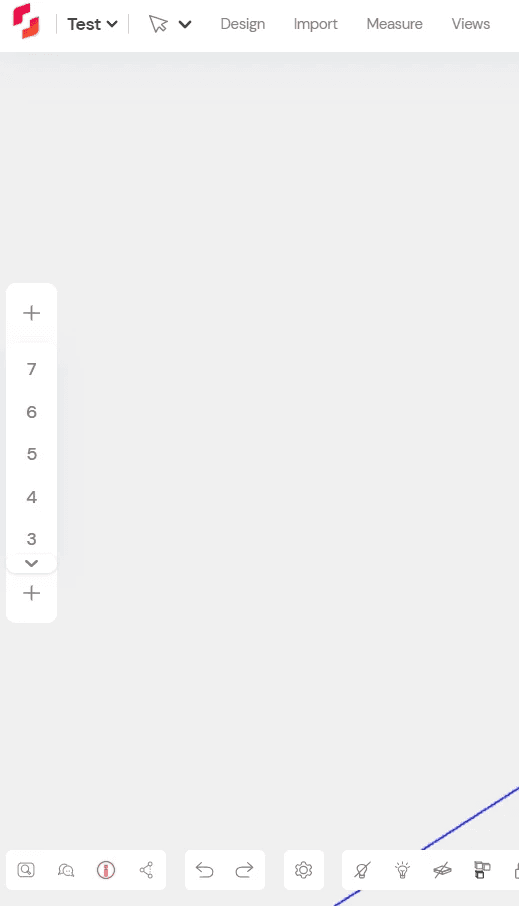
Visibility of System Status
Visibility of System Status
Visibility of System Status


1
Violation
Violation
Violation
Recommendation
Recommendation
Recommendation
Severity
Severity
Severity
1.1
1.1
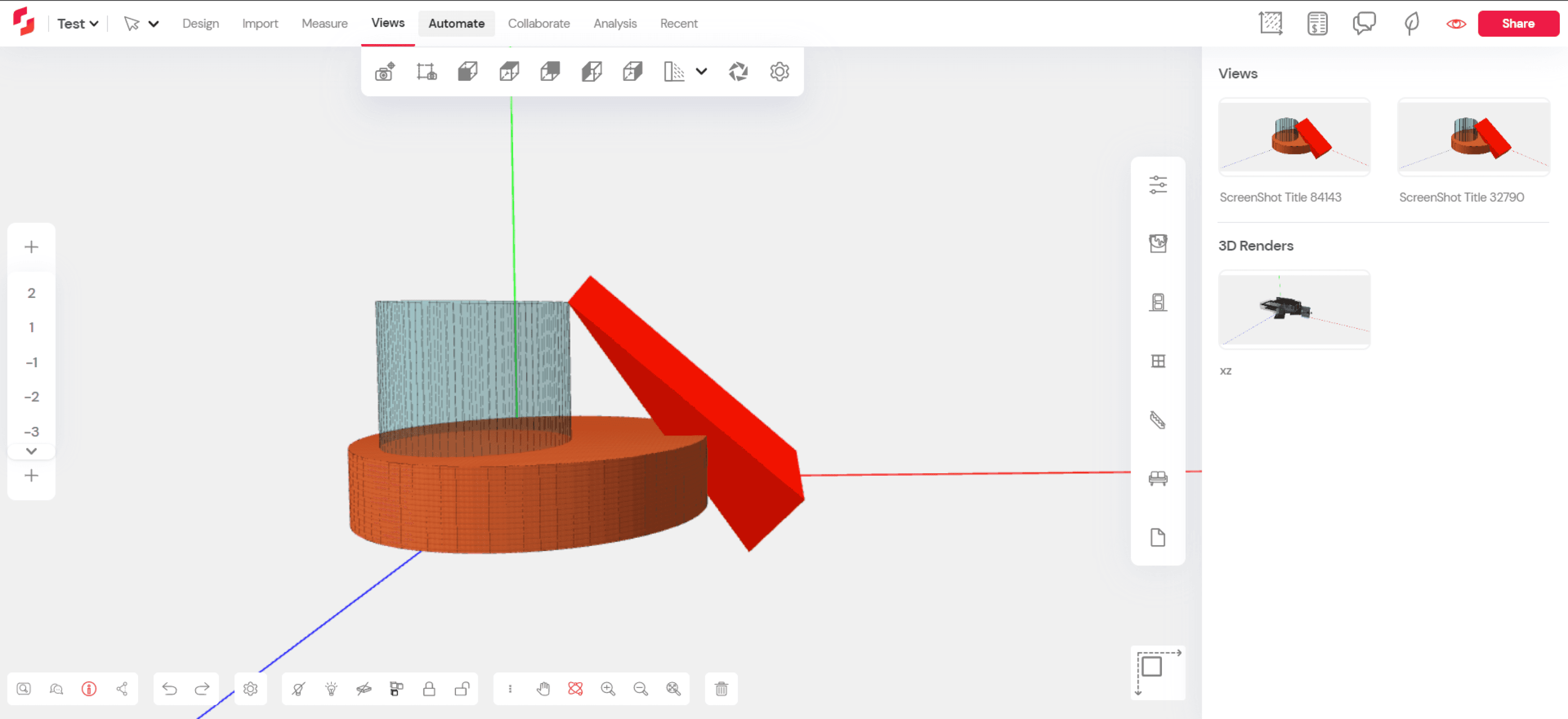
The Contrast of the panel to the canvas is low and may lead to accessibility issue for a color blind person.
The Contrast of the panel to the canvas is low and may lead to accessibility issue for a color blind person.
The Contrast of the panel to the canvas is low and may lead to accessibility issue for a color blind person.
Color of the panels can be darkened or a thin border can be provided.
Color of the panels can be darkened or a thin border can be provided.
Color of the panels can be darkened or a thin border can be provided.
1
1.2
1.2
The icon at the lower right part of the canvas is meant for transition between the 2D and the 3D state. But the icon shows 2D state while 3D canvas is active and vise versa.
The icon at the lower right part of the canvas is meant for transition between the 2D and the 3D state. But the icon shows 2D state while 3D canvas is active and vise versa.
Design of the 3D axis controller can be modified with additional views.
Design of the 3D axis controller can be modified with additional views.
Match between system and the real world
Match between system and the real world
Match between system and the real world
1
Violation
Violation
Violation
Recommendation
Recommendation
Recommendation
Severity
Severity
Severity
2.1
2.1
None
None
None
None
0
3. User control and freedom
3. User control and freedom
3. User control and freedom

1
Violation
Violation
Recommendation
Recommendation
Severity
Severity
Severity
3.1
3.1
Multiple viewport option is not available which gives the end users transitioning from other similar software more freedom and control.
Multiple viewport option is not available which gives the end users transitioning from other similar software more freedom and control.
Multiple viewport interface can be introduced.
Multiple viewport interface can be introduced.
3
3.2
3.2
The UI sizes are well optimized for a minimal design but a size variation option will strengthen the design from accessibility PoV, thus giving more control.
The UI sizes are well optimized for a minimal design but a size variation option will strengthen the design from accessibility PoV, thus giving more control.
Further survey requires to introduce bigger UIs option.
Further survey requires to introduce bigger UIs option.
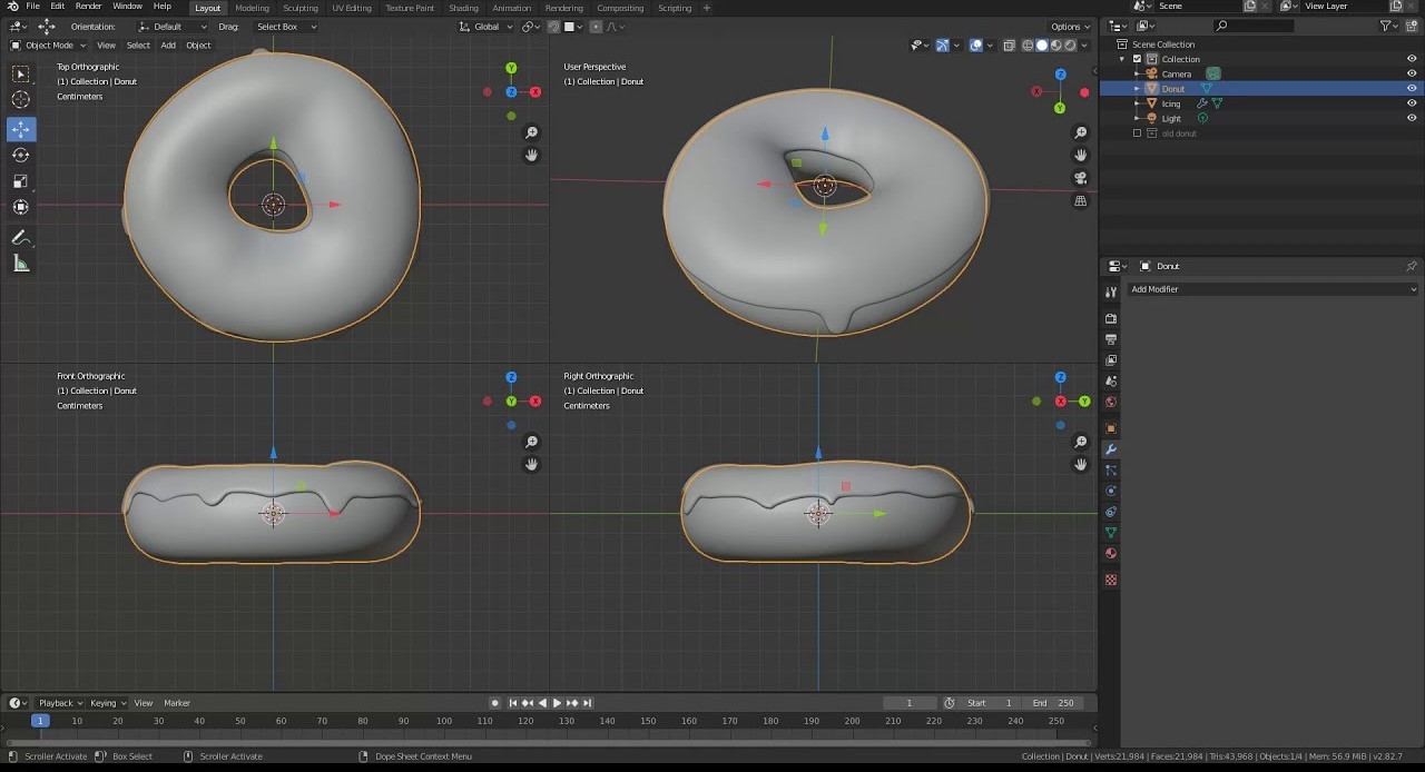
Workspaces of Blender and SketchUp
Workspaces of Blender and SketchUp
The workspace has multiple viewport options for better usability PoV.
Both the software shows the standard Axis colours- X (Red), Y(Green) and Z (Blue).
The workspace has multiple viewport options for better usability PoV.
Both the software shows the standard Axis colours- X (Red), Y(Green) and Z (Blue).

4. Consistency and standards
4. Consistency and standards
4. Consistency and standards
1
Violation
Violation
Violation
Recommendation
Recommendation
Recommendation
Severity
Severity
Severity
4.1
4.1
In most of the 3D software like SketchUp, Blender, Autodesk all are following the similar Axis colors - X (Red), Y(Green) and Z (Blue) while Snaptude switch the Y-Z axis colors.
In most of the 3D software like SketchUp, Blender, Autodesk all are following the similar Axis colors - X (Red), Y(Green) and Z (Blue) while Snaptude switch the Y-Z axis colors.
Axis should be standardize w.r.t. colors.
Axis should be standardize w.r.t. colors.
3
4.2
4.2
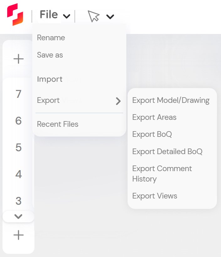
The rendering tab is hidden inside the views tab which is not line to all other 3D software in the industry
The rendering tab is hidden inside the views tab which is not line to all other 3D software in the industry
A separate Render Tab or icon can be introduced in the toolbar.
A separate Render Tab or icon can be introduced in the toolbar.
3
4.3
4.3
The software is missing the component and instance and group concept unlike other similar software
The software is missing the component and instance and group concept unlike other similar software
The component and group feature can be introduced.
The component and group feature can be introduced.
3
Error prevention
Error prevention
Error prevention
1
Violation
Violation
Violation
Recommendation
Recommendation
Recommendation
Severity
Severity
Severity
5.1
5.1
None
None
None
None
0
6. Recognition rather than recall
6. Recognition rather than recall
6. Recognition rather than recall
1
Violation
Violation
Violation
Recommendation
Recommendation
Recommendation
Severity
Severity
Severity
6.1
6.1
The rendering function is placed inside the view tab and will lead to memory load.
The rendering function is placed inside the view tab and will lead to memory load.
A separate Render Tab or icon can be introduced. (will also address point 4.2)
A separate Render Tab or icon can be introduced. (will also address point 4.2)
3
7. Flexibility and efficiency of use
7. Flexibility and efficiency of use
7. Flexibility and efficiency of use
1
Violation
Violation
Violation
Recommendation
Recommendation
Recommendation
Severity
Severity
Severity
7.1
7.1
Customization options are less in terms of styles, layout and icon sizes.
Customization options are less in terms of styles, layout and icon sizes.
Customization should be introduced for better control.
Customization should be introduced for better control.
3
Aesthetic and minimalist design
Aesthetic and minimalist design
Aesthetic and minimalist design
1
Violation
Violation
Violation
Recommendation
Recommendation
Recommendation
Severity
Severity
Severity
8.1
8.1
None
None
None
None
0
Help users recognize, diagnose, and recover from errors
Help users recognize, diagnose, and recover from errors
Help users recognize, diagnose, and recover from errors
1
Violation
Violation
Violation
Recommendation
Recommendation
Recommendation
Severity
Severity
Severity
9.1
9.1
None
None
None
None
0
Help and documentation
Help and documentation
Help and documentation
1
Violation
Violation
Violation
Recommendation
Recommendation
Recommendation
Severity
Severity
Severity
10.1
10.1
The keyboard shortcut icon resembles more of a "share icon" and showcases only few shortcuts.
The keyboard shortcut icon resembles more of a "share icon" and showcases only few shortcuts.
Keyboard shortcut icon should be standardized and more shortcuts can be added with a search and scroll functions.
Keyboard shortcut icon should be standardized and more shortcuts can be added with a search and scroll functions.
2
Proposal
Proposal
Proposal
Drawing from the insights gained through the heuristic analysis, I have crafted alternative option for the canvas in Snaptrude. These updated designs were developed with a clear focus on addressing the recommendations identified during the analysis and rectifying the identified usability violations.
By prioritizing usability, these updated canvas option aim to enhance the overall user experience without compromising the established aesthetic and brand identity of the software.
Revised Working Canvas
Revised Working Canvas
Revised Working Canvas
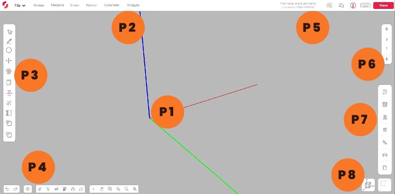
P 1
Contrast is increased by changing the colour of the working space to a darker shade of grey. The Axis is also standardized as X (Red), Y(Green), and Z (Blue) resembling the convention of RGB sequence which is deeply engrained in designers' psyche.
Contrast is increased by changing the colour of the working space to a darker shade of grey. The Axis is also standardized as X (Red), Y(Green), and Z (Blue) resembling the convention of RGB sequence which is deeply engrained in designers' psyche.

Before
Before

After
After
P 2
The top toolbar is optimized with lesser options. Also, an additional render tab is added. The project name drop-down tab is updated as File tab which resembles the conventional practice and also eliminates the confusion for a longer file name.
The top toolbar is optimized with lesser options. Also, an additional render tab is added. The project name drop-down tab is updated as File tab which resembles the conventional practice and also eliminates the confusion for a longer file name.

Before
Before

After
After
Analysis Tab - Before
Analysis Tab - Before

Analysis Tab - After
Analysis Tab - After

File Tab - Before
File Tab - Before
File Tab - After
Import option is added from the toolbar and export options are grouped together.
File Tab - After
Import option is added from the toolbar and export options are grouped together.
P 3
The left side bar is updated with selection and design tools which are used most frequently by the users.
The left side bar is updated with selection and design tools which are used most frequently by the users.
P 4
The lower left panel is optimized by removing the search,help tab from this location. The most common undo/redo tab is placed at the beginning for user convenience.
The lower left panel is optimized by removing the search,help tab from this location. The most common undo/redo tab is placed at the beginning for user convenience.
Before

After
P 5
The search, help, instructor and keyboard shortcut tabs are positioned in the top-right location along with the existing share tab as per convention.
The previous tabs are removed and placed under analysis tab inline to their roles.
The views icon tab is also removed due to the repetition in the toolbar.
The keyboard shortcut icon is also revised to eliminate the confusion.
The File name section is also added here along with the sub-heading of "last saved" reducing the user's cognitive load of rememberance.

Before

After
P 6
The Storey tab is positioned in the right side to reduce chaos in the right side.
The Storey tab is positioned in the right side to reduce chaos in the right side.
P 7
All the floating tabs in the right and the left are flexible to be positioned by the user. This feature is also inline to other similar products.
All the floating tabs in the right and the left are flexible to be positioned by the user. This feature is also inline to other similar products.
P 8
The state icon is updated with an icon set of 3D and 2D. The current state will be highlighted and the other will be faded. This will give the user the sense of present state and also the ease of transitioning.
The state icon is updated with an icon set of 3D and 2D. The current state will be highlighted and the other will be faded. This will give the user the sense of present state and also the ease of transitioning.
Before

After
Impact/Effort map
Impact/Effort map
Impact/Effort map
To make informed decisions on which issues to prioritize, it would be wise to utilize an impact/effort map. This map helps identify the issues that will have a significant impact when resolved.
To make informed decisions on which issues to prioritize, it would be wise to utilize an impact/effort map. This map helps identify the issues that will have a significant impact when resolved.
To make informed decisions on which issues to prioritize, it would be wise to utilize an impact/effort map. This map helps identify the issues that will have a significant impact when resolved.
Impact
Low impact - Low Effort
Low impact - Low Effort
High impact - Low Effort
High impact - Low Effort
Low impact - High Effort
Low impact - High Effort
High impact - High Effort
High impact - High Effort
Effort
P 1
P 6
P 5
P 4
P 3
P 2
P 7
P 8
Top Toolbar optimization
Change of background contrast and Axis colour
Change of background contrast and Axis colour
Left side bar update
Lower panel update
Top Right Panel update
Storey panel update
Floating Tab
Icon State update

Conclusion
Conclusion
Conclusion
The heuristic analysis method of UX for enhancing the usability of Snaptrude was a strategic decision. It provided me with a robust and reliable framework to evaluate the software's interface, identify key usability issues, and generate actionable recommendations for improvement. Further UX review can be conducted to discover more potential issues than our heuristic evaluation.
Let's tackle the issues that will make the biggest difference and create a better user experience for everyone involved!
Previous Project
Previous
Project
Designing for Engagement: A UX Journey in Developing a Startup's Digital Presence
Designing for Engagement: A UX Journey in Developing a Startup's Digital Presence
Let's solve understand the problems together !!
Let's solve understand the problems together !!
Designed by Kaushik Das
Designed by Kaushik Das